
Paul Lindström shares what you need to consider when creating designs for digitally printed textiles.
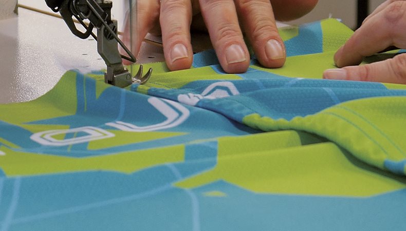
Digital printing on textiles is a fantastic option for communicating new ideas in print using fabrics. There is a huge range of possibilities for what is achievable when you combine digital printing and textiles for all types of applications, from signage to apparel to interior decorating. The design consideration for outdoor applications like signs or tents and gazebos is different from those for interior design and apparel. However, there are some technical facets that several digital print projects share.
When preparing print projects using digital printers suitable for fabrics and textiles, you can use the same checklist as for conventional, that is, analogue printing like offset, screen or flexo. However, if anyone has informed you that there are no special technical requirements for digital printing regarding the way the artwork is prepared, they are unfortunately mistaken.
It is important to consider the resolution of images and using the most suitable type of file format for vector-based illustrations and for pixel-based images when reviewing artwork. Other technical factors that should be considered and optimised include the bleed, overprint (or not), trapping, pattern repeat (if applicable), types of font used etc.
In regard to colour management, not every colour can be reproduced in every printer and on every substrate. Don’t believe anyone who tells you otherwise because it’s not true. If you are concerned about colour accuracy in your print project, there are some basics to keep in mind at the outset.
A few common errors in Preflight
The term ‘Preflight’ was originally used in aviation as far back as 1935. The term refers to the checks that a pilot and ground crew had to do before clearing a plane for take-off. Chuck Weger, a consultant within the graphic arts industry concluded in 1990 that something similar was needed for handling electronic artwork before sending it off to be printed. A preflight checklist for print production can be as simple as a written list of “don’t forget to check that. . .” or utilising special software to check files before sending them off to the printer.
What to watch out for in your artwork preparation
The most common error in artwork being sent for production at the printer’s is when images are at a far too low resolution to be printed. However, for some large format production, when the printed matter needs to be viewed at a far distance you don’t need to follow the general rule of around 300 ppi resolution (pixels per inch). But you should stay well over 100 ppi effective resolution even for textile printing. By ‘effective’ we mean what the resolution is after you have inserted the image and enlarged it in the layout software. If you add an image at let’s say 300 ppi but then enlarge the image by 200%, you half the effective resolution and it’s then at 150ppi in the artwork. If the image is to be viewed close-up, then the image may appear somewhat blurred. But on the other hand, fabric is by nature a substrate that is not completely smooth. Therefore. you may get away with a fairly low resolution in the images. But keep an eye on this. It’s always better to get it right before you send the work off to be printed.
‘Bleed’ refers to print that needs to go entirely to the edge of the substrate. It’s the term for when a printed area is meant to be cut off but you want the image to go over the trimmed edge. Always ensure that you have some 3-5 mm bleed on any image, so you don’t have a gap when the fabric is cut or stitched together either with other parts of a garment or for interior décor.
Trapping’ is the term used for when different colours touch in a design and depending on the characteristics of the ink, you may have an unintended change in colour in the area where they overlap. For example, if you have an area with pure yellow and another area of cyan (blue) side-by-side there will be green of the overlap due to some slight misregistration in the printing process. But thankfully, most digital printing presses are extremely precise in how they lay down ink. Therefore, in most cases this shouldn’t be a problem. But if in doubt you ought to check with the prepress department at your contracted printer as they can instruct if compensation for trapping must be done in your artwork. Sometimes this is better dealt with in the workflow system used in the prepress department. If so they will tell you their plans. Either way, it is important to ask the question.
How to prepare your artwork
Most print service providers with experience of digital colour printing on textiles will provide guidance on how the artwork should be prepared for a certain type of production and project.
You should expect some instructions on which file format the printer prefers for images and logos. Regarding artwork created in Adobe Illustrator, it’s normal to suggest that the text in illustrations and logos is converted to vectors. Vectorisation converts text into outlines to evade problems with missing fonts in artwork.
You should also expect instructions from the printer regarding colour management, specifically which colour profiles they prefer for RGB work and their recommended ICC profiles for CMYK work. If you address colours in your artwork as defined spot colours, you must be certain if the printer can manage true spot colours or if the colours are converted to the colour space (ink setup) of the printing device. If spot colours will be converted, it is important you check that the colours meet your expectation so make sure you ask for colour accurate proofs before the final print production.
Several professional designers of artwork for high end graphic arts production use dedicated software for preflight checks. The most well-known software includes Callas PDF Toolbox, Enfocus PitStop and Markzware FlightCheck. If you use Adobe CC then you have some basic preflight functions in InDesign and a ‘light’ version of the Callas PDF Toolbox is embedded in Adobe Acrobat Pro. If you haven’t tried this before it should be worthwhile as there are many fixups available in the preflight functions in Acrobat Pro.
Some of the final adjustments and optimisations of your artwork are made in the professional software used in the prepress department. Examples are workflow and Raster Image Processing systems (RIP) from vendors like EFI with their Fiery RIP series, used by many vendors, among them HP, and the graphics industry preferred RIP across all industry sectors. In addition, there are special versions for digital print on fabrics developed by Ergosoft for Roland DG. However, while those RIP systems can achieve a lot to enhance your artwork, they may not be able to fix serious errors or shortcomings. So, it is crucial to learn which key preflight steps you need to pay attention to and ensure you prepare your artwork wisely. This way you will accomplish the top-quality end result you aimed for.